



.gif)


No items found.
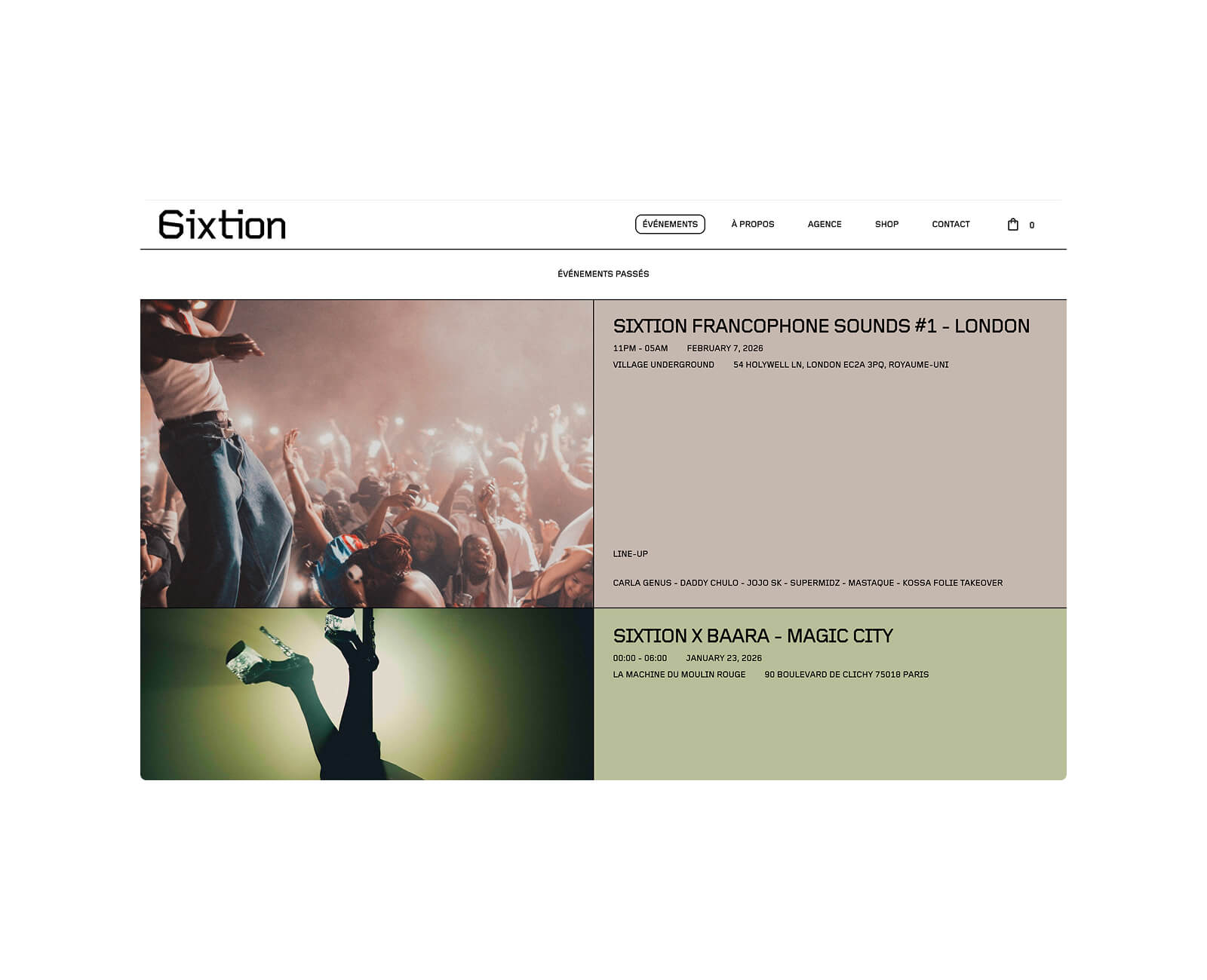
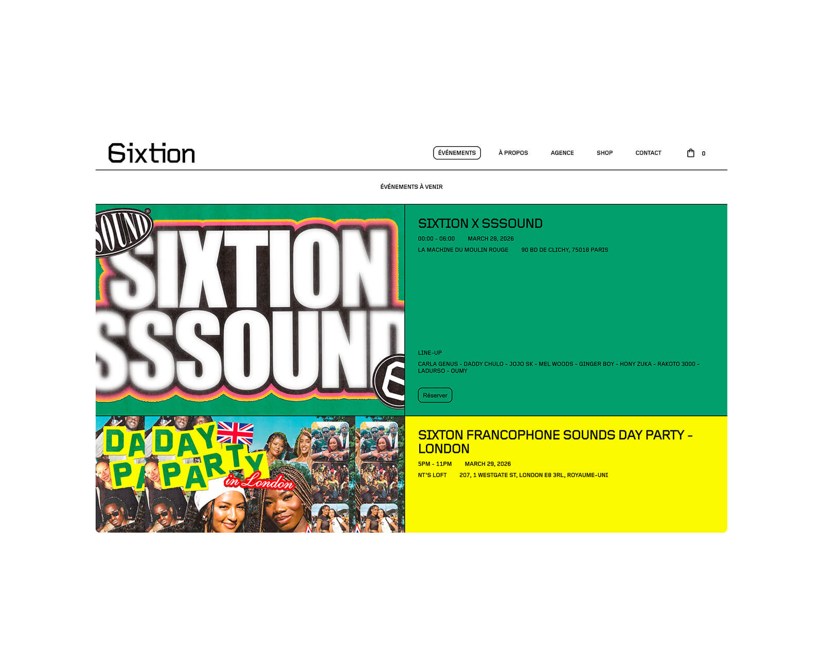
Redesign Sixtion's visual identity by developing a distinctive symbol, both minimal and immediately recognizable, able to support the collective's growth over time.
Inspired by Wim Crouwel's Gridnik typeface, the new logo merges the S and the 6 to create a distinctive, instantly recognizable symbol. Minimal and modern, it conveys the collective's dynamism while asserting its visual identity over time. This new graphic direction supports Sixtion's growth and strengthens its impact among fans of music and Afro-descendant culture.